R148 Release Notes (3/12/18)
Comments
-
My guess is that they don't have the resources to dedicate someone to redesigning the steam UI for the new features. So their options were:
1.) Use the same UI for both versions
2.) Delay the new feature until resource free up to redesign the steam version.
3.) Don't give steam users the new feature.
Considering that the vast majority of the player base is on mobile, it's not a surprise they went with (1).
4 -
How about we wait and see what the new feature is before sharpening pitchforks. Could absolutely be worth it. Would be nice if IceIX, Brigby, or Will let us know what was down the pipeline or more on why it had to change. But I say we wait until we have all the information before we react.
4 -
Simple explanation: the new feature is ready now, but there was no time to redesign the Steam UI to include it. Because the whining over not having features that Mobile has would be far, far greater than this current whining about using the Mobile UI, they decided to (perhaps temporarily) switch Steam to the Mobile UI so they could give everyone the new feature at the same time. The Steam UI may switch back to how it was before in a future update, once they've had some time to add the new feature.
0 -
No one's said it's going to be temporary.Daiches said:What part about UI change to prepare for new feature don't the Steam players get? This is temporary to prepare for a new feature coming out likely in the next update. And looking at how badly they had to change the look for Steam it's going to be worth it. No?
1 -
I haven't play this game on mobile before, but I've noticed on Steam when you're on the team select screen before a match, boosted characters no longer show their boosted health. Is that normal? Nothing has changed in battle.
Also, if it's temporary, I have no problem and I'll admit my frustration is premature. But nothing has implied this isn't permanent yet.1 -
Save yourself some clicking by tapping escape instead. It was always the faster option. Still annoying when leveling characters.0
-
Hopefully they will sync steam and mobile accounts. So we become able to play with a single account in different plataforms.What's Changed:- In preparation of an upcoming feature, the Character Info screen on the Steam version of the game matches the mobile version of the screen.
If is not that, please give our previous layout back. This "mobile" style is terrible.3 -
Terrible, counter-intuitive, overall bad on all fronts. This new feature better be DDQ's level of good if they don't want some master race backlash...GAH.1
-
Can I rollback to R147? UI update is hideous.
4 -
You know it will be the mcu version. No way will MPQ go with the historically accurate comic version of Valkyrie. Not after mockingbird.0
-
How do you get a histoically accurate version of a mythological character?Wumpushunter said:You know it will be the mcu version. No way will MPQ go with the historically accurate comic version of Valkyrie. Not after mockingbird.2 -
Ugh what is this monstrosity...
 2
2 -
The new feature better be worth it because the Steam interface was far superior to the mobile one. It was basically the only advantage to being a Steam player over the mobile swarms
 0
0 -
Good lord. I thought it was a bit wonky at first seeing the pack animation put the full screen comic cover up which then shrinks a bit for a blue border and smaller buttons. But I liked the arrow that let you see what other abilities would do and all that kind of thing.
Then I started using those covers and it's so bad now. Big empty space on the sides of the screen.
There's less immediate information available. I can't just click on an ability to learn about it. I have to click the arrow to get to the ability screen and click the ability there. To go back I have to click back through the abilities to get to other information. All of this used to just be on one page.
I applied a page to 2* Daken just now and had to figure out how to see what his current cover arrangement was.
Not to mention the weird design to move the "back" button away from the top left corner where my muscle memory tells me it is.
I applied a cover to a champ and it showed me a picture of some ISO. No idea how much I earned. Just that I got some ISO.
I want to apply some ISO to Ragnarok, so I click him and have to click right twice to get to the level up screen.
Again, ALL OF THIS used to be on one page. Easy to read, easy to see.
Remember, good UI design is like running a dolphin extermination job. The fewer clicks the better.
3 -
Covers on the vine now show up in the train screen, so would this be part of this new feature: https://imgur.com/a/pf1IB
0 -
Sorry for the double post, I only just saw this.Sandmaker said:My guess is that they don't have the resources to dedicate someone to redesigning the steam UI for the new features. So their options were:
1.) Use the same UI for both versions
2.) Delay the new feature until resource free up to redesign the steam version.
3.) Don't give steam users the new feature.
Considering that the vast majority of the player base is on mobile, it's not a surprise they went with (1).
I'm hoping they go for option 4.)
Have the Steam users suffer this UI design so we can all enjoy the new feature, and in the mean time we work on updating the Steam UI so the old style can work alongside the new feature.
1 -
I asked for this in Discord, the answer was not really reassuring, like, at allDragon_Nexus said:
I'm hoping they go for option 4.)
Have the Steam users suffer this UI design so we can all enjoy the new feature, and in the mean time we work on updating the Steam UI so the old style can work alongside the new feature.
2 -
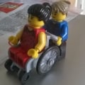
I have actual footage of a steam user looking at the new UI.

8 -
Just saying, if any of the upcoming changes involves just adding one button to the character UI I'm just gonna lose it
3
Categories
- All Categories
- 45.9K Marvel Puzzle Quest
- 1.6K MPQ News and Announcements
- 20.9K MPQ General Discussion
- 6.5K MPQ Bugs and Technical Issues
- 3K MPQ Tips and Guides
- 2.1K MPQ Character Discussion
- 187 MPQ Supports Discussion
- 2.5K MPQ Events, Tournaments, and Missions
- 2.8K MPQ Alliances
- 6.4K MPQ Suggestions and Feedback
- 14.1K Magic: The Gathering - Puzzle Quest
- 540 MtGPQ News & Announcements
- 5.6K MtGPQ General Discussion
- 99 MtGPQ Tips & Guides
- 456 MtGPQ Deck Strategy & Planeswalker Discussion
- 317 MtGPQ Events
- 68 MtGPQ Coalitions
- 1.2K MtGPQ Suggestions & Feedback
- 5.9K MtGPQ Bugs & Technical Issues
- 550 Other 505 Go Inc. Games
- 21 Puzzle Quest: The Legend Returns
- 7 Adventure Gnome
- 6 Word Designer: Country Home
- 471 Other Games
- 179 General Discussion
- 292 Off Topic
- 7 505 Go Inc. Forum Rules
- 7 Forum Rules and Site Announcements


