R142 Release Notes (12/18/17)
Comments
-
Echoing everyone elses comments, change the AP bar back please. Its really annoying.4
-
For the love of all that is holy......why do the developers continually change things that aren't broken? It is idiotic to have the enemy AP bar pop up when it is their turn. Do the developers even play this game?2
-
Not of fan of the new UI, I’m happy enough to only see the enemy AP when I press on the little arrow, not on every one of their turns, please consider removing this!
Also the candy cane passive AP bars look stupid.1 -
I'm not as put off by the enemy 'Power Bar' as most (sorry, couldn't help myself). Don't really look at it much, it turns out I'm looking at the board 99% of the time. It is helpful to see if you are close to getting nuked, though. I like that aspect of it.
Perhaps the easiest solution is to allow players to toggle the view? When/if you are curious to see the enemy Power Bar, tap a button? Otherwise it stays at the default which is your own.0 -
Once I figured out what was going on with the power bar switch, I liked it. It's kind of annoying tapping the arrow every time I want to see how much AP they have - this way, I get a quick glance every time they take a turn. It's not precise, but I can get a pretty good idea if I'm about to be nuked.1
-
I HATE the new UI.
We've already had one alliance member quit playing and I may be next.
I want my money back.
If nothing else, make it an option we can turn off.0 -
@Brigby was the iphone x update still included? There was nothing about it in the ios release notes, and it doesn't seem different.0
-
I dont mind the passieve stripes, as it had to be changed to provide the colors of the powers, even when at 0 ap (useful with new toon, or rarely used required). I agree it perhaps could have been done in a little more pretty fashion...
But the enemy power bars at THE moment you wanna check OWN bars is annoying as hell and has to go. Or at least be changed as suggested below:cpeyton3535 said:Perhaps the easiest solution is to allow players to toggle the view? When/if you are curious to see the enemy Power Bar, tap a button? Otherwise it stays at the default which is your own.
1 -
Another vote to say the passive bats are ok, but the AP display switch is awful.
Thanks2 -
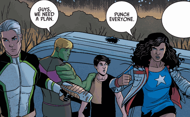
These, along with the Heroes for Hire store having two Captain Americas who don’t appear to be part of the Crash rotation, are making me think, “Yeah, America Chavez (Miss America) sounds about right.”STOPTHIS said:
Apperently, her powers come from The Demiurge... probably doesn’t mean anything.0 -
I have to agree. I would prefer this bit not remain.Phumade said:
@Brigby [Deleted portion] Players use the down time of hte enemy turn to glance at what powers are fireable and what combos are possible. By flipping between the player and AI perspective. Its broken an ingrained behavior and it looks really/feels really disruptive.- \On mobile devices, the AP gauges for each power has been updated. The opacity on missing AP has been increased and Passive powers are now represented by alternating dark and light bars to help distinguish the power from activated powers.
But, I like the efforts being put into UI elements. It's fine if not everything is perfect -- as long as there is an opportunity for player feedback. This kind of ethic of evolution is a good thing. On the whole, I like where things are headed.0 -
I actually like this change to the UI. IOS user here on an ipad mini. Perhaps screen real estate makes a difference? The ap bar is now packed with useful information without me having to tap it to see where the other team stands.
Ho hum
0 -
I’ve come to like the new bar. It would be nice to be able to turn if off for those that don’t but don’t totally Roll it back.0
-
I dislike the new AP bar, but it can be improved. Nobody care how much AP the goons have or use; in fact we only care about enemy AP if they're about to fire a power at us or it's related to one of our own powers (Mordo, for example).
Maybe the AP bar could show up only when an attack is imminent (not from the goons though). Or when a character's power is dependent on the enemy's AP (once it reaches a certain threshold). Also, the enemy's AP bar should not replace the player's- it should be more on the right or above it, so it doesn't get confusing.
Of course, the best thing would be if it was all optional, so we can pick and choose what features we want.
0 -
AdamMagus said:
More reason to release her character in MPQ. This way more people are exposed to her. Those not familiar with her might be inclined to start reading her comics. It's random if it's her but now it makes sense.
0 -
-
It's Billy Russo aka Jigsaw haven't had anything to go with the Punisher release.0
-
If you're going to give her comics a shot, I'd say steer clear of her solo title. It's a train wreck. Check out Ultimates or Young Avengers instead.Punisher5784 said:AdamMagus said:More reason to release her character in MPQ. This way more people are exposed to her. Those not familiar with her might be inclined to start reading her comics. It's random if it's her but now it makes sense.
0 -
Please go back to the previous interface. The ap bar flip is very distracting and completely unnecessary. Also the strips are silly and unnecessary too.0
Categories
- All Categories
- 45.8K Marvel Puzzle Quest
- 1.6K MPQ News and Announcements
- 20.8K MPQ General Discussion
- 6.5K MPQ Bugs and Technical Issues
- 3K MPQ Tips and Guides
- 2.1K MPQ Character Discussion
- 186 MPQ Supports Discussion
- 2.5K MPQ Events, Tournaments, and Missions
- 2.8K MPQ Alliances
- 6.4K MPQ Suggestions and Feedback
- 14.1K Magic: The Gathering - Puzzle Quest
- 539 MtGPQ News & Announcements
- 5.6K MtGPQ General Discussion
- 99 MtGPQ Tips & Guides
- 454 MtGPQ Deck Strategy & Planeswalker Discussion
- 316 MtGPQ Events
- 68 MtGPQ Coalitions
- 1.2K MtGPQ Suggestions & Feedback
- 5.8K MtGPQ Bugs & Technical Issues
- 550 Other 505 Go Inc. Games
- 21 Puzzle Quest: The Legend Returns
- 7 Adventure Gnome
- 6 Word Designer: Country Home
- 471 Other Games
- 179 General Discussion
- 292 Off Topic
- 7 505 Go Inc. Forum Rules
- 7 Forum Rules and Site Announcements


