Improved Art
apexpredator85
Posts: 22 Just Dropped In
Whoever the artist is now with game please keep them on for good or at least an extended period of time. The faces have a lot more detail now is infinitely more aesthetically pleasing to look at rather than those faces a while back. Okoye even if I’m not interested in her looks like the actual character in the movie while Jessica Jones looks....... just awful..... just so awful ......
4
Comments
-
And why don’t we put a rose on the grave of st4rlord and 5tarlord, or thor gladiator artworks?
I really like Kraven one as all the old artworks like wolverine. To me the artwork in this game must be the first thing, or the second! Not so-so or nice, only the best ones.1 -
Invisible woman art design could be much better2
-
There is definitely quite a spread in quality of artwork for the characters. Personally I find 4*Blade to be on pretty much the lowest end of the scale, very much a 'broad strokes' kind of design when compared to 'top end' characters like Vulture. It just seems there is so much more little details in the drawings.
I don't know if redesigning things is an anwser though. It worked out pretty good for 2/3/4* Wolvie in my opinion, but 3* Cap's old head was way better in my opinion. He didn't used to look like he's staring into a very bright light or just can't read that small print in the middle distance...0 -
Art for Okoye is one of the best in the whole game, if not the best.0
-
Because I always invoke it whenever one of these threads comes up, I'm just going to quote a past comment:mega ghost said:DayvBang wrote:
They can't all be Iceman.ClydeFrog76 wrote:I really don't like the artist they're using now. Very bland, and they don't do faces well at all.
And who can forget the original Spider-Man art. You could open a beer bottle with that Adam's apple.
0 -
I wish there were credits in the game. I've always thought that Storm looks like the work of Ian Gibson. I like all the artwork, except for the animation when Moonstone uses Control Shift. No human body looks like that!0
-
5* Archangel, his teeth bother me so much....1
-
DyingLegend said:Invisible woman art design could be much better
Agreed on both of these, but Homunculus Iceman says hi.StevO-J said:Personally I find 4*Blade to be on pretty much the lowest end of the scale....1 -
There are a few duds, but 98% of the character art in MPQ is spectacular.
Way better than most printed comic books nowadays.0 -
I've seen mannaquins with more life-like proportionsDyingLegend said:Invisible woman art design could be much better0 -
Keep in mind that Invisible Woman came out in the days where a lot of characters were basically palette swaps (the reason I think they chose Dark Avengers/Dark Reign in the first place). Based on the face and lips, I think they were going from a "let's modify Black Widow" position at the time.DyingLegend said:Invisible woman art design could be much better0 -
I love the art and the non-Dark Avenger animations. I often turn them on when I'm not shielding or racing through PVE.
0 -
I always thought she looks like she was a modification of art for Reed.ZeiramMR said:
Keep in mind that Invisible Woman came out in the days where a lot of characters were basically palette swaps (the reason I think they chose Dark Avengers/Dark Reign in the first place). Based on the face and lips, I think they were going from a "let's modify Black Widow" position at the time.DyingLegend said:Invisible woman art design could be much better
0 -
For me, Green Goblin is the tippy tops in terms of art whereas 5* Hulk looks like he was drawn with smeared crayons. 5* Spidey could use a redraw as well. Do not like that broadway leap holding the weblines.
'Animation' wise The Thing gets the nod. He's got some nice little spring to his drawings that really helps the effect. Love when they add little tricks like that to the art.
0 -
I just wish someone would fix Hawkguy's right arm. It looks like someone spilt skin-coloured ink then tried to cover it up by blending it into the background!
Irritates me everytime I see it.0 -
These two stood out in my mind in term of weirdness: Invisible Woman and Iceman.
Otherwise, the rest (based on those that I can remember now) looks great.0 -
I thought it was a Parmigianino tributedjrdjr said:
I've seen mannaquins with more life-like proportionsDyingLegend said:Invisible woman art design could be much better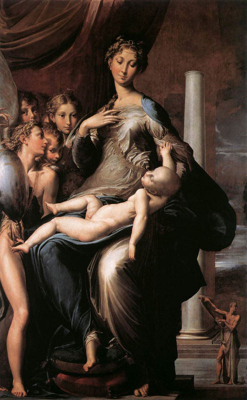
?file=Recruit_Invisible_Woman_(Classic).png)
?file=Recruit_Invisible_Woman_(Classic).png)

2 -
The art has always been one of the things that attracted, and still attracts, me to this game. Sure, there are the meh ones, as have already been mentioned. Another is War Machine; he just looks so boring and uninspired. Compare with the level of detail on the Tony Stark Iron Man suits, for example. But as a whole, the artwork is near top-notch.
And can I just mention the delightful entendres of Okoye's art. From her spear going straight up Spidey's torso in her Don't Freeze store, to her poking literally everyone during a match. And she really looks like Danai Gurira, so extra points for that1 -
Plus she kinda blocks the bottom row of tiles on Steam, so you can't even really see what you are matching thanks to her spear... Maybe it's better on mobile, but they clearly didn't check Steam out...BlackBoltRocks said:The art has always been one of the things that attracted, and still attracts, me to this game. Sure, there are the meh ones, as have already been mentioned. Another is War Machine; he just looks so boring and uninspired. Compare with the level of detail on the Tony Stark Iron Man suits, for example. But as a whole, the artwork is near top-notch.
And can I just mention the delightful entendres of Okoye's art. From her spear going straight up Spidey's torso in her Don't Freeze store, to her poking literally everyone during a match. And she really looks like Danai Gurira, so extra points for that0
Categories
- All Categories
- 45.9K Marvel Puzzle Quest
- 1.6K MPQ News and Announcements
- 20.8K MPQ General Discussion
- 6.5K MPQ Bugs and Technical Issues
- 3K MPQ Tips and Guides
- 2.1K MPQ Character Discussion
- 186 MPQ Supports Discussion
- 2.5K MPQ Events, Tournaments, and Missions
- 2.8K MPQ Alliances
- 6.4K MPQ Suggestions and Feedback
- 14.1K Magic: The Gathering - Puzzle Quest
- 539 MtGPQ News & Announcements
- 5.6K MtGPQ General Discussion
- 99 MtGPQ Tips & Guides
- 454 MtGPQ Deck Strategy & Planeswalker Discussion
- 316 MtGPQ Events
- 68 MtGPQ Coalitions
- 1.2K MtGPQ Suggestions & Feedback
- 5.8K MtGPQ Bugs & Technical Issues
- 550 Other 505 Go Inc. Games
- 21 Puzzle Quest: The Legend Returns
- 7 Adventure Gnome
- 6 Word Designer: Country Home
- 471 Other Games
- 179 General Discussion
- 292 Off Topic
- 7 505 Go Inc. Forum Rules
- 7 Forum Rules and Site Announcements

