Poor artwork choices!
Comments
-
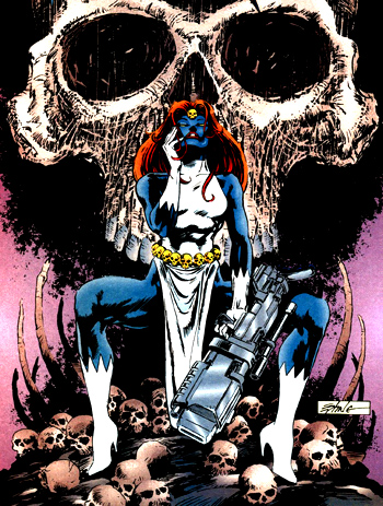
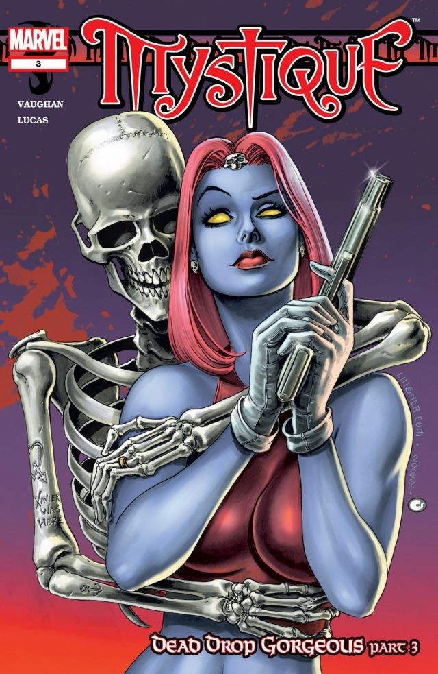
I don't think all covers from Mystique series (with her black outfit she's wearing) fit her in-game artworks where she uses white dress.
I prefer cover with almost exact same dress she's wearing in the game, for example cover from X-Men (vol 2) #194.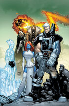
That's why I also think Psylocke's cover doesn't fit her in-game artworks too.0 -
The Sentry also similarly has one arm raised with his hand rested on his head in his portrait picture. Arm-raising isn't some kind of boob-showing art technique. It's just a stylised pose.The Viceroy wrote:I found the "welcome to the gun show" arm pose the most distracting part. Sadly the T&A pose is something to be expected, especially for this character.
It was like "if we put her arm in a more normal pose, it would potentially be in front of her ****, and we can't have that".
That made it seem like the art is trying too hard to convey something. Whether it be the T&A "**** & side boob pose" trope, or whatever.0 -
For your viewing pleasure.
 0
0


Categories
- All Categories
- 45.9K Marvel Puzzle Quest
- 1.6K MPQ News and Announcements
- 20.9K MPQ General Discussion
- 6.5K MPQ Bugs and Technical Issues
- 3K MPQ Tips and Guides
- 2.1K MPQ Character Discussion
- 186 MPQ Supports Discussion
- 2.5K MPQ Events, Tournaments, and Missions
- 2.8K MPQ Alliances
- 6.4K MPQ Suggestions and Feedback
- 14.1K Magic: The Gathering - Puzzle Quest
- 539 MtGPQ News & Announcements
- 5.6K MtGPQ General Discussion
- 99 MtGPQ Tips & Guides
- 454 MtGPQ Deck Strategy & Planeswalker Discussion
- 316 MtGPQ Events
- 68 MtGPQ Coalitions
- 1.2K MtGPQ Suggestions & Feedback
- 5.9K MtGPQ Bugs & Technical Issues
- 550 Other 505 Go Inc. Games
- 21 Puzzle Quest: The Legend Returns
- 7 Adventure Gnome
- 6 Word Designer: Country Home
- 471 Other Games
- 179 General Discussion
- 292 Off Topic
- 7 505 Go Inc. Forum Rules
- 7 Forum Rules and Site Announcements