Poor artwork choices!

I really like deadpool and was disappointed with the cover you guys choose, seriously there are so many better ones. But I think Mystiques could be the worst of all. I know some of you may disagree but if you've seen the other sweet covers, which would have looked so much better you'd be disappointed too!
I'm assuming it's too late to change it, but if not, please do!!
I'm assuming it's too late to change it, but if not, please do!!
0
Comments
-
I don't find it to be that big of a deal but I did like the yellow one they had in the preview article more than the one they ended up using.
 0
0 -
In the Mystique reveal interview, the screenshots featured two different covers.
I guess Mystique #22 conveys the shapeshifter aspect that she is known for. #12 just looks like a generic hero action pose while running away from an explosion.
Textless covers below: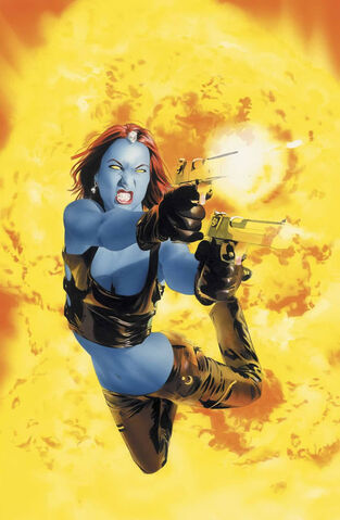
Anyone have one they would prefer to be in-game?0 -
The one they ended up going with is... strange, but the alternate cover in the interview screenshot looks like the cover for a tween serial novel about a girl who leads an exciting double life as a globetrotting mystical commando but primarily explores how she deals with "friends" and "boys" as part of her civilian cover.
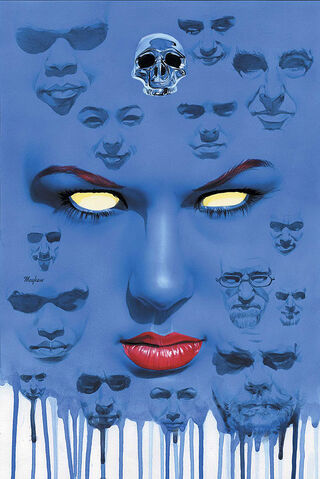
There must be far cooler covers out there, but of the two, I much prefer the creepy faces-in-melting-face one.0 -
Of the two, I prefer the blue one as it kinda looks like Walter White is one of the faces.0
-
I really like the Mystique cover myself.
The ones I don't like are the old covers like Baby Torch, Beast, and Mags. They may have been good in their time, but when they are lined up with some of the awesome covers we have in game they look really lacklustre.0 -
Screw that, X-Men #1 is still a great cover. Great issue, maybe not so much, but great cover.
I think the ones I'd most like to change are Doc Ock, 3* Torch, Doom, Mohawk Storm (Doomwar didn't have very good covers), and Ms. Marvel.0 -
ComradeVS wrote:I really like the Mystique cover myself.
The ones I don't like are the old covers like Baby Torch, Beast, and Mags. They may have been good in their time, but when they are lined up with some of the awesome covers we have in game they look really lacklustre.
I actually really like cmags and beast covers, they form 2 parts of a 4 part picture, colossus could of one of those too.0 -
If they release Cyclops and Gambit/Rogue with those covers, that would be cool.
I didn't actually see the full cover together, and now the Magneto cover makes a lot more sense.0 -
I assumed Deadpool's was in reference to the fact that this is a videogame. So it'd be somewhat apropos.Jimilinho wrote:I really like deadpool and was disappointed with the cover you guys choose, seriously there are so many better ones. But I think Mystiques could be the worst of all. I know some of you may disagree but if you've seen the other sweet covers, which would have looked so much better you'd be disappointed too!
I'm assuming it's too late to change it, but if not, please do!!
I think both Mystique covers are a bit odd but while I sort of like the "plain" blue one better, it does NOT translate well onto a mobile device. It just looks like a blue blob. I was glad to see someone dig up the real cover, because otherwise I thought it was pretty worthless, too.
My problem, personally, is more with the stupid spine-breaking T&A pose they put her in. Really, really sad. Hopefully that image (from this preview below) also isn't actually in the game.0 -
Seeing the cover, now I understand the "lips" icon.
Not that it makes sense, or care for it, but I understand where it came from.
Edit: even the blue cover has a skull in it.0 -
It's there. You can see it by clicking on/scrolling through the reward covers showing in the Heroic right now.loroku wrote:My problem, personally, is more with the stupid spine-breaking T&A pose they put her in. Really, really sad. Hopefully that image (from this preview below) also isn't actually in the game.0 -
Its not complicated. They most likely didn't go with the gunsplosion one because that's not how she looks in the game (at all).0
-
Did they really have to pick the cover that makes her look like Cassandra from Dr. Who?
 0
0 -
Is that really a T&A pose? It looks really tame to me. She has one of the smaller sets of **** I've seen in the game/Marvel Universe.
We could have her sitting at a desk, typing up her memoirs. Would that be better?0 -
It is literally a T&A pose, because it has her **** in profile with her butt to the camera, showing off both, er, "assets."0
-
I define T&A poses as being GRATUITOUS and designed, specifically, to show off **** and ****.
I just don't think that pose does either. I dunno. I'm probably in the minority.0 -
I get that they are trying to push and market the new series', but c'mon.
I agree, there are several terrible covers, and some that could be better. There are plenty of amazing covers for Doom for example.
Black Panther, Steve Rogers, Nick Fury, Falcon, all pretty weak. No disrespect to Copial but there were a million better choices and more significant artists for Spiderman. And does everyone associated with the x-men have a 85% chance of it being a Jim Lee cover?
Where's Romata (either of them ), or Miller, or McFarlane, Steranko, Ditko, or gee, I don't know Jack Kirby? Those cats all put out some of the best artwork in comics.
There's some really great covers, but it would have been nice to see the odd honest classic issue. Even if you are going to go modern, the choices for the ones noted above including Mystique are terrible.0 -
If Dr. Strange is ever released, his cover better be Ditko.0
-
RefinedBean wrote:If Dr. Strange is ever released, his cover better be Ditko.
As a HUGE Dr. Strange fan and collector I agree with all my heart. Although there was some impressive work done on the orignal series after Ditko left.0


Categories
- All Categories
- 45.9K Marvel Puzzle Quest
- 1.6K MPQ News and Announcements
- 20.8K MPQ General Discussion
- 6.5K MPQ Bugs and Technical Issues
- 3K MPQ Tips and Guides
- 2.1K MPQ Character Discussion
- 186 MPQ Supports Discussion
- 2.5K MPQ Events, Tournaments, and Missions
- 2.8K MPQ Alliances
- 6.4K MPQ Suggestions and Feedback
- 14.1K Magic: The Gathering - Puzzle Quest
- 539 MtGPQ News & Announcements
- 5.6K MtGPQ General Discussion
- 99 MtGPQ Tips & Guides
- 454 MtGPQ Deck Strategy & Planeswalker Discussion
- 316 MtGPQ Events
- 68 MtGPQ Coalitions
- 1.2K MtGPQ Suggestions & Feedback
- 5.9K MtGPQ Bugs & Technical Issues
- 550 Other 505 Go Inc. Games
- 21 Puzzle Quest: The Legend Returns
- 7 Adventure Gnome
- 6 Word Designer: Country Home
- 471 Other Games
- 179 General Discussion
- 292 Off Topic
- 7 505 Go Inc. Forum Rules
- 7 Forum Rules and Site Announcements