Should we keep the Fantastic 4 cover art?
Options
Comments
-
Yes.
I guess it was the computer that said 'no'Dragon_Nexus said:I'm disappointed the people who said "no" haven't commented. I'd have liked to have heard why they're either not a fan of the new art work, or why they enjoyed the old covers more.0 -
Maybe. (Keep some, not others. Comment below =D )
I liked that one, as well, but both are good. I didn't like her original cover, so I'm glad that changed. I don't have strong opinions on any of the others.GrimSkald said:I'm one of the few, apparently, who really like the previous iteration of the Invisible Woman cover. I thought the composition of it, with the three scenes shot through it, was really cool. To be fair, however, I'm a fan of Coleen Doran's work.
0 -
No.Dragon_Nexus said:I'm disappointed the people who said "no" haven't commented. I'd have liked to have heard why they're either not a fan of the new art work, or why they enjoyed the old covers more.
Fine!
I just feel like the difference in style, from the rest of the in game covers, is what irks me? The characters look too real - like they are drawn after a photograph?
But the portraits are all good, all look quite pretty. If they stayed, I'd probably get used to it without much trouble.1 -
Yes.Kolence said:Dragon_Nexus said:I'm disappointed the people who said "no" haven't commented. I'd have liked to have heard why they're either not a fan of the new art work, or why they enjoyed the old covers more.
Fine!
I just feel like the difference in style, from the rest of the in game covers, is what irks me? The characters look too real - like they are drawn after a photograph?
But the portraits are all good, all look quite pretty. If they stayed, I'd probably get used to it without much trouble.It's something I like about the game, the wide variety of comic covers in different styles from different artists.I see where you're coming from, Artgerm tends to have a more hyper detailed look to them.0 -
Yes.Kolence said:Dragon_Nexus said:I'm disappointed the people who said "no" haven't commented. I'd have liked to have heard why they're either not a fan of the new art work, or why they enjoyed the old covers more.
Fine!
I just feel like the difference in style, from the rest of the in game covers, is what irks me? The characters look too real - like they are drawn after a photograph?
But the portraits are all good, all look quite pretty. If they stayed, I'd probably get used to it without much trouble.And a bunch of characters (e.g. 3* Starlord) look like they were finger painted or something.then there's Spider-Ham0 -
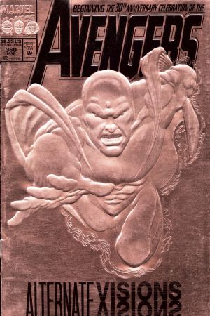
So, alternate Vision cover?

2 -
Save that for a 4 or 5* Vision since we learned the 3* is the least played in the tier.IceIX said:So, alternate Vision cover? 2
2 -
Yes.I suggested a new Vision cover a while back.
 1
1 -
Yes.IceIX said:So, alternate Vision cover?
 Except it would probably end up with Marvel's scan of the cover, which doesn't look quite as good.
1
Categories
- All Categories
- 45.3K Marvel Puzzle Quest
- 1.6K MPQ News and Announcements
- 20.5K MPQ General Discussion
- 6.3K MPQ Bugs and Technical Issues
- 3K MPQ Tips and Guides
- 2.1K MPQ Character Discussion
- 173 MPQ Supports Discussion
- 2.5K MPQ Events, Tournaments, and Missions
- 2.8K MPQ Alliances
- 6.4K MPQ Suggestions and Feedback
- 13.9K Magic: The Gathering - Puzzle Quest
- 528 MtGPQ News & Announcements
- 5.5K MtGPQ General Discussion
- 99 MtGPQ Tips & Guides
- 441 MtGPQ Deck Strategy & Planeswalker Discussion
- 306 MtGPQ Events
- 60 MtGPQ Coalitions
- 1.2K MtGPQ Suggestions & Feedback
- 5.8K MtGPQ Bugs & Technical Issues
- 548 Other 505 Go Inc. Games
- 21 Puzzle Quest: The Legend Returns
- 5 Adventure Gnome
- 6 Word Designer: Country Home
- 390 Other Games
- 149 General Discussion
- 241 Off Topic
- 7 505 Go Inc. Forum Rules
- 7 Forum Rules and Site Announcements


