Character Artwork

White_Deth
Posts: 63 Match Maker
Just what the hell is going on with some of the art for the recent characters? I started playing a year ago and was impressed by most of the in game artwork. Black panther, wolverine, cyclops, indestructable hulk, colossus, beast, antman, nick fury, jugs, sw pretty much most tbh. Then some new guys were released throughout that time. Thanos was good but then super bland 5* panther, the new spidey and the 2 worst of all. Sandman and danny rand. Its not just the overall art but also the coloring. There just isnt any depth or texture. Sorry its just i like drawing and such myself and love looking at games art on general, some of it is amazing. But the art is falling flat atm. Anyone agree?
1
Comments
-
Well for one the artist who did the initial artwork for the game left some time ago, I believe.
I like the new artist *overall*. Their work has bolder colours, I find. That said, yeah some faces aren't quite on point. I'm really not keen on the new Starlord or Sandman (his mouth is all kinds of wrong in the fighting portrait. Looks okay when he makes a move though!)
Even the old artist wasn't always on point. From the moment she was released I thought Psylocke looked wrong. Flat greasy looking hair and her face didn't seem quite right. Mighty Thor is my fave Marvel character, and I hate the way her eyes are visible behind the helmet in the game. Not keen on her >=O expression either.
There are goods and bads with both artists. Clock & Dagger are *fantastic*, as are Carol, Medusa, Rocket & Groot, Gamora and so on.
0 -
Sandman is the only one I really think is bad from the list. Sandman’s face reminds me of Strong Mad:


PS - This forum is still a million times worse than the old. That took way longer to attach two images via the mobile then it should have...0 -
Most of the new artwork has been okay, but Rogue's face is kinda ugly. If it's the same guy, his Jean & Carol look similarly ugly in 3/4 view or profile. I don't mean "ugly" as in "does not meet my standard of beauty" so much as "off."1
-
I don’t know, if you go back and really look at some of the older characters you will have a few wth moments. Invisible woman’s neck is really long and her left arm is really small, it reminds me of that one Kristin wig character on snl. Thing’s face is pretty weird even for a rock monster. Every wolverine has the exact same pose and facial expression. And iceman is a running joke when it comes to in game artwork. There’s also been some really good art lately. C&d are one of the best in the game imo, right up there with Phoenix. hawk guy is good also, as are carol, Medusa and 4cage.0
-
Oh jeez, now I can't unsee it...charmbots said:Invisible woman’s neck is really long and her left arm is really small,
0 -
I've thought the artwork has always been hit and miss (Invisible Woman's artwork, for instance, is almost as creepy as Iceman...almost and I agree with the general opinion that Sandman is pretty bad), so it's hard for me to really say the older or newer is better. Some of the recent MCU characters (in particular Strange, Mordo and Vulture) have been pretty outstanding in capturing the look/feel of the film character, in my opinion, but as the OP said, some of the original artwork is also quite good.0
-
It's improved overall IMO. Like Dragon_Nexus said, the colors are bolder and more striking. Example, 3* and 4* Elektras both have the same pose but the 4*'s skin looks like a ghost, while the 3* has a darker, more tanned skin which looks much better IMO, though it could just be a case of difference in source material. The way they draw facial features is also much improved, they now seem more lifelike to me instead of seemingly coming out of a comic book.
I can't recall off the top of my head any of the newer characters that look horrible to me though. Even Sandman that some have mentioned is at worst average to me. Meanwhile I can safely say Psylocke and Invisble Woman are some of the worst looking characters IMO. I mean, I'd rather have Sandman looking like he is now that have him drawn in the old Invisible Woman style
0 -
Every time I see Invisible Woman, I wonder if maybe the artist got her and Mister Fantastic's power sets confused.
It's also kind of odd to me that all three Storms have exactly the same animations, just with the different costumes/hair. For 1* and 3*, I can sort of get it, since they're the same powers, but 2* blue having the exactly the same as 1*/3* yellow and 2* yellow being 1*/3* black is kind of weird. Well, 2* yellow, I can also kind of see, since she's not actually visible in that one, so they didn't have to do any new work at all.
0 -
I think Coulson's morphing potato face is particularly upsetting.0
-
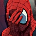
But let's not forget that the new artist greatly improved Spider-Man from this monstrosity the original artist gave us:

Weird, creepy warped arms and fingers, but it's this bottom-left pose that takes the cake. It looks like he has terrible posture and eyesight.
2 -
I like the graphic overall. The only ones I don't like that much are Gamora (wished they released a more comic look - like the 2017 mini series - the ones she has as cover) and Yondu a little. This is because they tried to make them similar to the movie cast. Gamora doesn't look like the meanest and dangerous women in the Galaxy.
0 -
I feel like some of the artwork definitely leans towards the cartoony side. Then there are the Ultron/Civil War releases, particularly 5* Cap, IM XLVI and Vision who look like they wandered in from a random advertising campaign for those movies.0
-
Yeah old Spidey art was terrible. In his character select pose, you can see that if he had his arms straight his hands would go all the way down to his calf. It's monstrous.mega ghost said:But let's not forget that the new artist greatly improved Spider-Man from this monstrosity the original artist gave us:
Weird, creepy warped arms and fingers, but it's this bottom-left pose that takes the cake. It looks like he has terrible posture and eyesight.0 -
Kamala's "action" artworks look ok, but her static character portrait is terrible and doesn't capture her dynamic teenage energy at all. Her mask is too thin and looks more like wire-rimmed glasses.1
-
3* Captain Marvel's old lady look is the worst, hands down.
2 -
I'm not overly in love with Apocalypse artwork.
0 -
Rogue looks good. Mockingbird looks amazing - especially her alternate outfit in the character selection screen. Gambit looks pretty good. They better not screw up Nightcrawler.0
-
Cool topic.0
-
Oh absolutely. That expression is so bizarre. It's like she's walked into someone else's house not realising they're the kind of person with insane kids that run amock.Captain_Carlman said:3* Captain Marvel's old lady look is the worst, hands down.
Never been too keen on Kamala's look in the game. Like you say, her action pose isn't bad, but her standing pose...she always looks like an old lady to me, facially. I think it's the strongly defined lines around her mouth.CNash said:Kamala's "action" artworks look ok, but her static character portrait is terrible and doesn't capture her dynamic teenage energy at all. Her mask is too thin and looks more like wire-rimmed glasses.
As for Spider Man...I'd totally forgotten how bad that anatomy was. I hadn't even seen his action pose in full before...it's horrendous!
My issue with Sandman is the "action pose" as it's been called here.
The mouth. It's not possible to make teeth align like that without detaching the jaw from the skull. Otherwise I think his other poses look pretty good! 0
0


Categories
- All Categories
- 45.8K Marvel Puzzle Quest
- 1.6K MPQ News and Announcements
- 20.8K MPQ General Discussion
- 6.5K MPQ Bugs and Technical Issues
- 3K MPQ Tips and Guides
- 2.1K MPQ Character Discussion
- 186 MPQ Supports Discussion
- 2.5K MPQ Events, Tournaments, and Missions
- 2.8K MPQ Alliances
- 6.4K MPQ Suggestions and Feedback
- 14.1K Magic: The Gathering - Puzzle Quest
- 539 MtGPQ News & Announcements
- 5.6K MtGPQ General Discussion
- 99 MtGPQ Tips & Guides
- 454 MtGPQ Deck Strategy & Planeswalker Discussion
- 316 MtGPQ Events
- 68 MtGPQ Coalitions
- 1.2K MtGPQ Suggestions & Feedback
- 5.8K MtGPQ Bugs & Technical Issues
- 550 Other 505 Go Inc. Games
- 21 Puzzle Quest: The Legend Returns
- 7 Adventure Gnome
- 6 Word Designer: Country Home
- 471 Other Games
- 179 General Discussion
- 292 Off Topic
- 7 505 Go Inc. Forum Rules
- 7 Forum Rules and Site Announcements