Release Notes 7.4.1

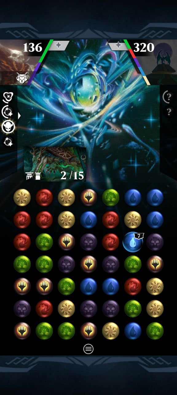
I found the visual improvement to the loyalty progression bar within each skill "box" next to the PW's head interesting and useful. What sometimes happens is that on mobile, due to the small screen, it's not clear when there's just one point left until the skill is available, and you have to go to the skill list to see if it can be used that turn or not. The same thing happens with the opponent's skills, of course.
So I think a simple addition that would change the color of the outer box (to green, for example) if the skill is complete enough to be used would be interesting and very useful.
In the example image Grist has 5 loyalty points but seems to has the first ability complete.
Comments
-
Not only is it difficult to see if there is enough loyalty for the first ability, it is impossible to see how much loyalty is needed for the second or third ability.
There are many situations where I won’t use the first ability and will instead want to save up for the second or third ability so this additional visual clutter serves no practical purpose.
The way the sections fill in turn from the bottom up is aesthetically displeasing and does not work with PWs like Jace Mirror Mage (whose third ability costs less than the second).
Perhaps it would be better to fill each section from the side showing how much is needed for each ability? Or, even better than a progress bar which is difficult to read, display the actual numbers so that people can tell at-a-glance what is available.
As it currently stands, I need to open the PW menu anyway to see what my total loyalty is relative to all three abilities as well as to actually activate the abilities.
This new visual intrusion is unhelpful and distracts from gameplay while adding little of value—it is frustrating that time and energy were spent on this feature rather than any of the many quality of life improvements requested by the player base. https://forums.d3go.com/discussion/91288/small-quality-of-life-improvements
3 -
@fenelope said:
Not only is it difficult to see if there is enough loyalty for the first ability, it is impossible to see how much loyalty is needed for the second or third ability.There are many situations where I won’t use the first ability and will instead want to save up for the second or third ability so this additional visual clutter serves no practical purpose.
The way the sections fill in turn from the bottom up is aesthetically displeasing and does not work with PWs like Jace Mirror Mage (whose third ability costs less than the second).
Perhaps it would be better to fill each section from the side showing how much is needed for each ability? Or, even better than a progress bar which is difficult to read, display the actual numbers so that people can tell at-a-glance what is available.
As it currently stands, I need to open the PW menu anyway to see what my total loyalty is relative to all three abilities as well as to actually activate the abilities.
This new visual intrusion is unhelpful and distracts from gameplay while adding little of value—it is frustrating that time and energy were spent on this feature rather than any of the many quality of life improvements requested by the player base. https://forums.d3go.com/discussion/91288/small-quality-of-life-improvements
Yes, probably showing the number of loyalty in screen all the time is more clear and good solution (in addition to marking which skills have enough loyalty to be activated) to not to open lot of times the PW menu. At the end if you play a lot one PW usually know how many loyalty need for each ability
1 -
@Keyler yes, there is plenty of room to display the loyalty opposite the life total.
Perhaps the silly little indicators can display the numerical amount of loyalty needed instead of a progress bar? They can even light up to show that they are ready to use!
Perhaps they can even serve as shortcuts to activate the abilities without opening the PW screen?
It is very strange that @Magic:PQ Support Team allocates resources to unhelpful things like this instead of communicating with the player base.
1 -
@fenelope said:
@Keyler yes, there is plenty of room to display the loyalty opposite the life total.Perhaps the silly little indicators can display the numerical amount of loyalty needed instead of a progress bar? They can even light up to show that they are ready to use!
Perhaps they can even serve as shortcuts to activate the abilities without opening the PW screen?
It is very strange that @Magic:PQ Support Team allocates resources to unhelpful things like this instead of communicating with the player base.
Yeah!! I like both suggestions. There should be more space between the active buttons (or make them bigger) so that the second ability can't be accidentally activated instead of the first, but it would be much more dynamic to use.
Adding the ability cost in the square would also be good. This way, you know how much loyalty it will deduct when you use it, and you can use all the abilities without ever entering the ability menu (if you know what each one does). Combined with being able to see the loyalty level at all times, it would save a lot of time and screen manipulation related to ability use.
I don't understand why the developers don't test these types of additions, much less why they don't consult with the community if they aren't planning to invest a few minutes into thinking about the best way to implement them too directly improve the players' gameplay experience.1 -
Fully agree with the above comments. I appreciate that the team wants to make the game visually more attractive and to improve the UX, but the result is not much of an improvement. At least not for me.
1 -
Filling out the star with a different color once the ability is full would also be nice
0 -
@TIMEWARP said:
Fully agree with the above comments. I appreciate that the team wants to make the game visually more attractive and to improve the UX, but the result is not much of an improvement. At least not for me.Happy to see that at least some people like this change, altho personally I find it superfluous and visually distracting.
Perhaps some more QoL improvements could be implemented from this thread?
https://forums.d3go.com/discussion/91288/small-quality-of-life-improvements
We tried to keep 'em simple and easy to implement (at least we hope so!)1 -
Is it me or is the PW select menu scrolling a hell of a lot faster now?
I like that!
2


Categories
- All Categories
- 46K Marvel Puzzle Quest
- 1.6K MPQ News and Announcements
- 20.9K MPQ General Discussion
- 6.5K MPQ Bugs and Technical Issues
- 3K MPQ Tips and Guides
- 2.1K MPQ Character Discussion
- 187 MPQ Supports Discussion
- 2.5K MPQ Events, Tournaments, and Missions
- 2.8K MPQ Alliances
- 6.4K MPQ Suggestions and Feedback
- 14.1K Magic: The Gathering - Puzzle Quest
- 542 MtGPQ News & Announcements
- 5.6K MtGPQ General Discussion
- 99 MtGPQ Tips & Guides
- 456 MtGPQ Deck Strategy & Planeswalker Discussion
- 318 MtGPQ Events
- 68 MtGPQ Coalitions
- 1.2K MtGPQ Suggestions & Feedback
- 5.9K MtGPQ Bugs & Technical Issues
- 550 Other 505 Go Inc. Games
- 21 Puzzle Quest: The Legend Returns
- 7 Adventure Gnome
- 6 Word Designer: Country Home
- 471 Other Games
- 179 General Discussion
- 292 Off Topic
- 7 505 Go Inc. Forum Rules
- 7 Forum Rules and Site Announcements