Please fix this UI design (Steam)

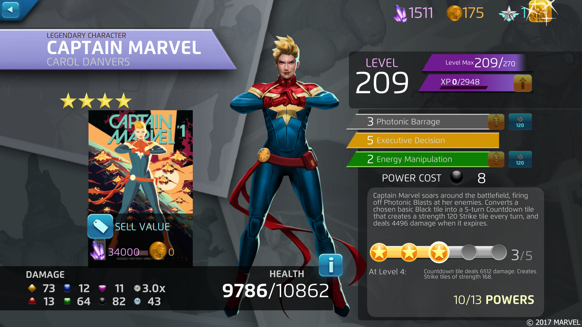
Steam UI got annihilated for the mobile design forever ago. It sucks. I adjusted. I put Steam in the title anyways just in case. The UI for adding covers to characters is poor. To spend shards, I can't click the giant button next to the shards. I have to click on a cover. Then I have to select shards to purchase the cover. But the order of purchase isn't intuitive - it's cover, CP, shards as my three options. One of these is super valuable, and it's right in between two that aren't.
It's late. I'm tired. I'm super pumped that I finally got enough shards my last cover for a 4* that I've been wanting. Riding that high, I go to the character. Click on the CP to purchase it. Hit confirm because I'm on autopilot. It's not until I do that I suddenly realize that I've absolutely wasted 120 CP. Why is this even an option?
I'm an extremely casual player. I've gotten more active as I've approached 5* transition level of LT token equivalents saved (was almost 290), but I've done DPD only some days for months. 120 CP is months worth of progress gone in a poof because there's a button there when there shouldn't be. There is one scenario where you would rather use CP than shards, and that's when a character isn't fully covered but you would rather pay CP to cover the character than use accumulated shards so that you can use the shards after you champ a character. How many people, in the entire player base of this game, would rather spend collect covers spending 120 CP each only to throw shards at champ levels.
Having the ability to choose is great. Please don't place the choice of "spend this one resource that you can't spend anywhere else because it has one function" next to the choice of "this is one of (if not) the most valuable resources in the game." The CP option has no business being anywhere near the other two.
I'd say I spent 120 CP to get a Legendary token for 271, but RNG already hated me enough that I had a cover saved. I spent 120 CP and received 2 CP for my efforts. Not even an extra 2 CP... just 2 CP that I now have sooner than I would have otherwise gotten it. Why?
Comments
-
As a Steam user, I can sympathize. I've been fortunate in that I've caught myself (twice) before doing the exact thing you mentioned. Once was with 5-star Hawkeye (There would have been a LOT of swearing if I hadn't caught myself...) and the other time was with a 4-star. I can also tell you that I've purchased at least a half-dozen Heroic 10-packs with HP prior to the "Quick Claim" button (which is a major improvement! Credit where credit is due!) because the "Confirm" and "Next" buttons on the screens were located right above where the 10-pack button is.
So far as I can tell, Steam is the proverbial red-headed stepchild, and the devs don't pay as much attention to that platform as they do their mobile users. The UI is terrible for Steam users. Actually, the UI in general is pretty bad (let us sort characters by something other than level!), but Steam's wastes about 2/3rd of the computer screen. There should be no reason to scroll vertically though several menus when you have huge amounts of real estate on the sides of your screen.
Going through your character's abilities takes a lot more clicks than it used to, and adding clicks is something that should be avoided as much as possible when you are designing something. The more clicks you have to make, the more likely you are to click on something that's not what you wanted to do. If you have a confirmation button, make sure it's in a different location than the initial button, so you physically need to move your mouse/finger in order to confirm.
The Chat window in Steam is completely broken, and has been for several releases now. Once you type enough characters to get past the window, you can't see anything you're typing. The cursor is also at least two or three characters away from where you're actually typing, so it's hard to tell which character will be deleted if you make a typo.
Short answer as to why those things are placed as close together as they are? To get you (or your alliance) to spend money. How else are you going to quickly recoup those 120 CP?
1 -
You are both right. Why they go out of their way to make it worse than it used to be is beyond me.
Sadly this is not the first nor will it be the last thread on the state of the steam ui.For those who don't use steam or don't know what we're on about check out these two screens.
The first is the old ui from the steam store page! and the second is one I just took of the same character page.https://i.imgur.com/5JwQjiz.jpg
Such a downgrade.
 0
0

Categories
- All Categories
- 44.9K Marvel Puzzle Quest
- 1.5K MPQ News and Announcements
- 20.4K MPQ General Discussion
- 3K MPQ Tips and Guides
- 2K MPQ Character Discussion
- 171 MPQ Supports Discussion
- 2.5K MPQ Events, Tournaments, and Missions
- 2.8K MPQ Alliances
- 6.3K MPQ Suggestions and Feedback
- 6.2K MPQ Bugs and Technical Issues
- 13.7K Magic: The Gathering - Puzzle Quest
- 510 MtGPQ News & Announcements
- 5.4K MtGPQ General Discussion
- 99 MtGPQ Tips & Guides
- 426 MtGPQ Deck Strategy & Planeswalker Discussion
- 301 MtGPQ Events
- 60 MtGPQ Coalitions
- 1.2K MtGPQ Suggestions & Feedback
- 5.7K MtGPQ Bugs & Technical Issues
- 548 Other 505 Go Inc. Games
- 21 Puzzle Quest: The Legend Returns
- 5 Adventure Gnome
- 6 Word Designer: Country Home
- 381 Other Games
- 142 General Discussion
- 239 Off Topic
- 7 505 Go Inc. Forum Rules
- 7 Forum Rules and Site Announcements