Your favorite "unfortunate" artwork

Sim Mayor
Posts: 309 Mover and Shaker
With all of the amazing artwork in this game, it's easy to overlook a few pieces that just don't quite make the cut. What artwork always puts a smile on your face for the wrong reasons? Bonus points if you have your own funny caption for the piece 
My personal fave is Drax's "Open up and say aahhh!" pic for Slice and Dice.
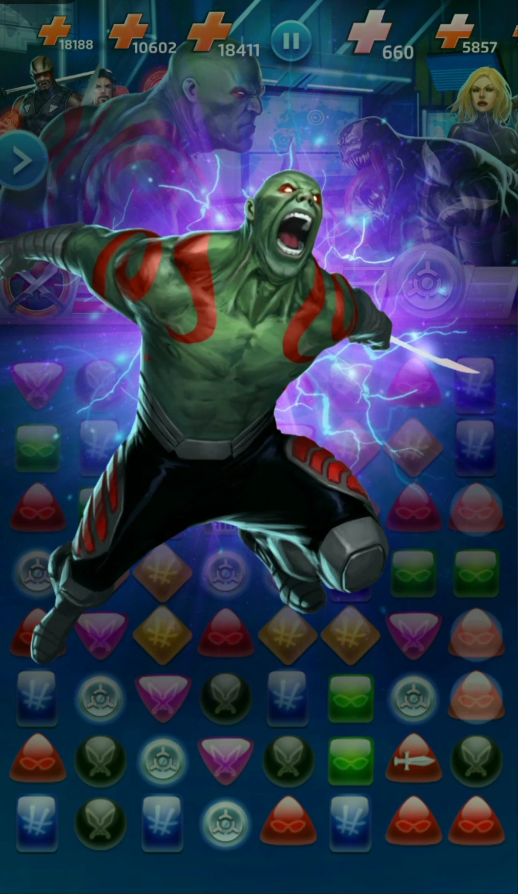
My personal fave is Drax's "Open up and say aahhh!" pic for Slice and Dice.
0
Comments
-

I’ll let you all handle the caption, lol.27 -
Didn't know Punisher was a *literal* gun nutDaredevil217 said:
I’ll let you all handle the caption, lol.4 -
How about the old loading screens where characters have the SHIELD logo on their crotches? And some of them were... grinding. Looking at you, C4rol0
-
Yeah, that C4rol load screen was... interesting.Crnch73 said:How about the old loading screens where characters have the SHIELD logo on their crotches? And some of them were... grinding. Looking at you, C4rol
As for that Heart of Darkness load screen... Somehow, I never picked that up in game, but now I cannot unsee it. 0 -
The first time I saw Sentry use his yellow was during the HAMMER Field Day sub of Webbed Wonder. As a result, I always think of it as "Food Poisoning" rather than "Sacrifice".
4 -
I like Carnage's symbiote scythes. I always imagine he is this mad chef who is furiously chopping vegetables!
1 -
The agent venom loading screen0
-
The TA hulk loading screen...so much nipple0
-
I like the vast majority of the artwork in MPQ, but Squirrel Girl's face is odd, and Iceman is downright creepy.2
-
The game does seem to have a problem drawing fingers in this game. First Moonstone’s horribly bent-back fingers in I want to say The Hunt, and now Black Panther’s awkward claws in his loading screen.
I can’t draw fingers either, but I’m not a professional.3 -
OMG the Valkyrie covers are terrible.
Whats the point of a cover that doesn't show the char?
Is there anychance we can get a Valkyrie variant for women of marvel month?2 -
Every Kingpin animation. From Fisk Defense (“Yooooouuuuuu!”), to Maggia Pawn (“Eyyyy, bada bing, bada boom, fuggetaboutit!”), and the notorious B.I.G. Finger (“Time for your exam. Now bend over.”).
Old Man Logan popping his viagra at 12 yellow is honorable mention as both unfortunate and kind of awesome all at once.1 -
Phumade said:OMG the Valkyrie covers are terrible.
Whats the point of a cover that doesn't show the char?
Is there anychance we can get a Valkyrie variant for women of marvel month?
I think the issue is marvel's Valkyrie doesn't look like movie Valkyrie...
2 -
Scarlet Witch looks nothing like her cover and no one seems to care. I don't see why it's an issue now....Dragon_Nexus said:Phumade said:OMG the Valkyrie covers are terrible.
Whats the point of a cover that doesn't show the char?
Is there anychance we can get a Valkyrie variant for women of marvel month?
I think the issue is marvel's Valkyrie doesn't look like movie Valkyrie...
You're probably right, though. Since Mordo they've been much more consistent with the artwork for the MCU ones.0 -
ZootSax said:
Scarlet Witch looks nothing like her cover and no one seems to care. I don't see why it's an issue now....Dragon_Nexus said:Phumade said:OMG the Valkyrie covers are terrible.
Whats the point of a cover that doesn't show the char?
Is there anychance we can get a Valkyrie variant for women of marvel month?
I think the issue is marvel's Valkyrie doesn't look like movie Valkyrie...
You're probably right, though. Since Mordo they've been much more consistent with the artwork for the MCU ones.
I care. I love Wanda's Classic look and have hoped for an alternate version ever since she was introduced. No luck it seems. Maybe if we get a fourstar version some day... 1
 -
This problem will be solved when Exiles #2 comes out on April 25th.Dragon_Nexus said:Phumade said:OMG the Valkyrie covers are terrible.
Whats the point of a cover that doesn't show the char?
Is there anychance we can get a Valkyrie variant for women of marvel month?
I think the issue is marvel's Valkyrie doesn't look like movie Valkyrie...
3 -
First of all, I love the art in this game. There are certain character models that are bordering on 'definitive' - like black suit Spider-Man, for example.
But there's something not quite right about the in-match profile of bearded Starlord.0 -
He looks way more like Seth Green than Chris Pratt.Dormammu said:First of all, I love the art in this game. There are certain character models that are bordering on 'definitive' - like black suit Spider-Man, for example.
But there's something not quite right about the in-match profile of bearded Starlord.
1 -
C'mon, what about Mr Fantastic's finger in every character selection screen? That's gotta be the worst by far, be it picking someone's nose through to sticking it in a variety of other unmentionables... Though admittedly hardly anyone ever uses him to know that.
Or 3* Carol's face in general - it just looks all... wrong.0 -
Hmmm I always thought he looked more like Seth RogenTPF Alexis said:
He looks way more like Seth Green than Chris Pratt.Dormammu said:First of all, I love the art in this game. There are certain character models that are bordering on 'definitive' - like black suit Spider-Man, for example.
But there's something not quite right about the in-match profile of bearded Starlord.")
My vote is for 3* cap. First they gave him some weird face lift for no reason a few years ago. Then his in match animations features him cross eyed and wearing a super tiny backpack that evokes the horrors of Rob Liefield and his pouches...0


Categories
- All Categories
- 46K Marvel Puzzle Quest
- 1.6K MPQ News and Announcements
- 20.9K MPQ General Discussion
- 6.5K MPQ Bugs and Technical Issues
- 3K MPQ Tips and Guides
- 2.1K MPQ Character Discussion
- 187 MPQ Supports Discussion
- 2.5K MPQ Events, Tournaments, and Missions
- 2.8K MPQ Alliances
- 6.4K MPQ Suggestions and Feedback
- 14.1K Magic: The Gathering - Puzzle Quest
- 542 MtGPQ News & Announcements
- 5.6K MtGPQ General Discussion
- 99 MtGPQ Tips & Guides
- 456 MtGPQ Deck Strategy & Planeswalker Discussion
- 318 MtGPQ Events
- 68 MtGPQ Coalitions
- 1.2K MtGPQ Suggestions & Feedback
- 5.9K MtGPQ Bugs & Technical Issues
- 550 Other 505 Go Inc. Games
- 21 Puzzle Quest: The Legend Returns
- 7 Adventure Gnome
- 6 Word Designer: Country Home
- 471 Other Games
- 179 General Discussion
- 292 Off Topic
- 7 505 Go Inc. Forum Rules
- 7 Forum Rules and Site Announcements