For Marvel buffs

Whose symbol is the "X" on blue and white background that appears while loading the game?
0
Comments
-
I assumed it was Cyclops since he has used that pattern on one of his costumes:
 0
0 -
To clarify, I don't know the answer myself
 0
0 -
Generic X-Men symbol; I think it's the same one that appeared on the X-Men boosts before those were discontinued. It'll probably be Prof. X's when he's introduced.0
-
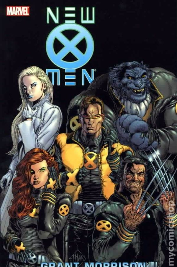
I would say the logo of the x-uniforms during the Grant Morrison's run. But probably "generic x-logo" is the right answer!0
-
It looks like someone's chest though. Maybe I remember wrong. Did any X-Men wear a suit like that at any point? Giant X with blue and white... stripes... I think.0
-
KevinMark wrote:It looks like someone's chest though. Maybe I remember wrong. Did any X-Men wear a suit like that at any point? Giant X with blue and white... stripes... I think.
The original incarnation of X-Factor pretty much all did, (see picture below, plus when Beast reverted to boring mode he wore one too). 0
0 -
 0
0 -
The generic X-Men logo is used in the Retired boost.

But the one in the loading screen has someone's costume. 0
0 -
donietsche wrote:
God. This reminds me of how much I hate Grant Morrison.0 -
I want to say Bobby Drake's (Iceman) costume, when drawn by Whilce Portacio (Uncanny X-Men Gold Team), was pale blue and white. I can't think of anyone else with that color scheme. It would have made more sense for it to be blue and gold to fit the generic team uniforms.0
-
Now we know for sure that is the symbol of X-Men but mystery still remains as I think it's part of someone's costume rather than just a symbol as it is the case in Juggernaut's symbol. Iceman seems plausible. I always thought this was taken from the art of an unreleased character in the game.zubalove wrote:I want to say Bobby Drake's (Iceman) costume, when drawn by Whilce Portacio (Uncanny X-Men Gold Team), was pale blue and white. I can't think of anyone else with that color scheme. It would have made more sense for it to be blue and gold to fit the generic team uniforms.0 -
zubalove wrote:donietsche wrote:
God. This reminds me of how much I hate Grant Morrison.
I basically love everything Grant wrote, so you can say I'm a fanboy, but may ask you why? I think his run on x-men was refreshing and compelling... and the artwork was top notch while Quitely was on board.0 -
I like Quitely's art in general, but it seems like everyone he draws just smelled a fart. Look at them, all sneering and clenching...donietsche wrote:... and the artwork was top notch while Quitely was on board.
I think this has improved since New X-Men, though.0 -
DayvBang wrote:
I like Quitely's art in general, but it seems like everyone he draws just smelled a fart. Look at them, all sneering and clenching...donietsche wrote:... and the artwork was top notch while Quitely was on board.
I think this has improved since New X-Men, though.
yes, Quitely's faces are somewhat "farty" I'll give you that! He still is a wonderful artist (All Star Superman is a masterpiece), maybe he was a bit out of his territory with the x-men (who are usually depicted in a "fashionable" way, so to speak).
It's all about style I guess... Quitely seems to be influenced to an extent by underground comics (R. Crumb is the first artist that comes to mind).
Anyway the cover I posted was drawn by Ethan Van Scrier.0 -
donietsche wrote:zubalove wrote:
God. This reminds me of how much I hate Grant Morrison.
I basically love everything Grant wrote, so you can say I'm a fanboy, but mayI ask you why? I think his run on x-men was refreshing and compelling... and the artwork was top notch while Quitely was on board.
I liked the beginning of his run, but the Weapon Plus and Magneto storylines were just freaking awful, and the Secondary Mutation stuff was really bad too0


Categories
- All Categories
- 45.8K Marvel Puzzle Quest
- 1.6K MPQ News and Announcements
- 20.8K MPQ General Discussion
- 6.5K MPQ Bugs and Technical Issues
- 3K MPQ Tips and Guides
- 2.1K MPQ Character Discussion
- 186 MPQ Supports Discussion
- 2.5K MPQ Events, Tournaments, and Missions
- 2.8K MPQ Alliances
- 6.4K MPQ Suggestions and Feedback
- 14.1K Magic: The Gathering - Puzzle Quest
- 539 MtGPQ News & Announcements
- 5.6K MtGPQ General Discussion
- 99 MtGPQ Tips & Guides
- 454 MtGPQ Deck Strategy & Planeswalker Discussion
- 316 MtGPQ Events
- 68 MtGPQ Coalitions
- 1.2K MtGPQ Suggestions & Feedback
- 5.8K MtGPQ Bugs & Technical Issues
- 550 Other 505 Go Inc. Games
- 21 Puzzle Quest: The Legend Returns
- 7 Adventure Gnome
- 6 Word Designer: Country Home
- 471 Other Games
- 179 General Discussion
- 292 Off Topic
- 7 505 Go Inc. Forum Rules
- 7 Forum Rules and Site Announcements